Jen Ball
Marmot
Packaging
Design Manager Cayla Fanelli
Design Collaboration Melissa Scotton, Josh Stalford, Jessica Lee
Designer Jen Ball
This project aimed to redesign Marmot’s hangtag system to align with the updated digital brand look. Goals included elevating the brand, simplifying content, using sustainable materials, and creating a
user-focused experience with thoughtful design details.
As a Graphic Designer, I worked with a team to explore design directions and finalize the system. I led the final execution, delivering a solution that met brand, user, and sustainability objectives.
Important
Disclaimer
Shared with managerial approval, this material is the property of Newell Brands and is presented solely to illustrate my work experience for interview purposes. It may not be shared or used beyond this context.

2020 Design
2026 Design

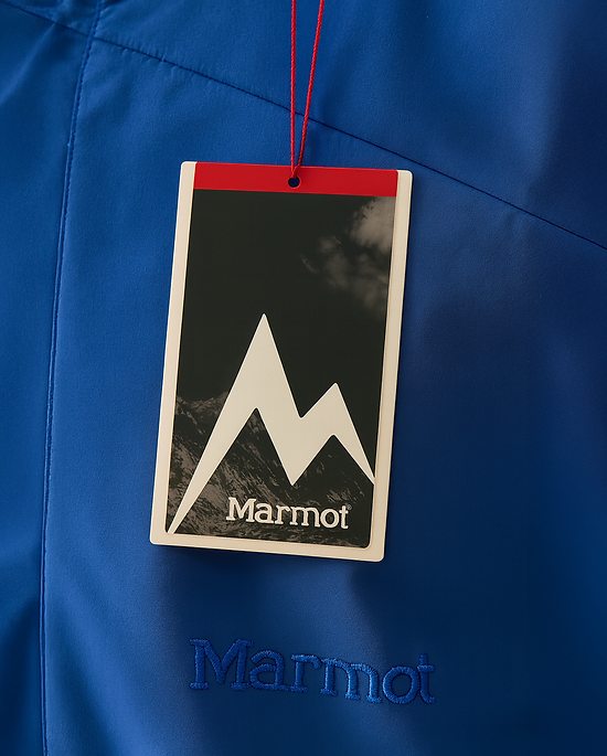
Existing hangtag
Marmot Packaging Refresh Goals
Elevate the Brand
Strengthen Marmot’s identity across
all touchpoints
Simplify Content
Streamline messaging while keeping key details
Sustainability & Cost Savings
Reduce hang tag card volume and use sustainable paper stock.
Ensure Consistency
Align with the
updated digital look
and feel
Focus On the User
Help customers feel confident in their purchase
Inspire Delight
Use creative shapes, messaging, and
design accents

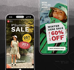
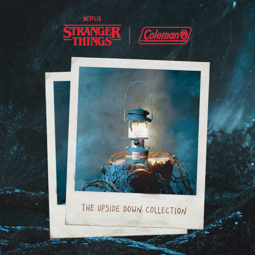
Competitive Review: Store Walk
This is my personal store walk audit, covering both competitors and standout brands from other industries to highlight best practices. It was compared against a broader full-team store audit.

Design Review 1: Initial Concepting
Each team member created initial designs based on competitive review insights, then collaborated to refine the best solutions for next steps.


These personal design iterations began by exploring bold ideas within the 'surprise and delight' theme. In team collaboration, we identified standout elements across our work to carry into the next design phase.

These personal design iterations reflect a more focused approach on simplicity, brand visibility, and stakeholder feedback following the initial review.
Chosen Direction Refinement
Once Brand selected a direction based on our team’s iterations and deep collaboration, I designed out the hangtag system for each product category, ensuring consistency and adherence to
the approved design.

High-Contrast Design for Maximum Visibility
A light-colored border contrasts with the dark top card, ensuring the hangtag stands out across all apparel shades, from light to dark (see examples below).

Top-Level Information
Strategically Placed
Key purchase-driving information is placed on the top flag, the area most frequently seen by customers. This placement helps them quickly assess whether the product meets their needs.
Refined Messaging Strategy
Copy is purposefully minimized and focused, highlighting only the four most essential feature bullets to keep messaging clear, concise, and impactful.
Immediate Recognition
of Product Fit
The product’s “fit” is given prominent placement for instant recognition, enabling fast, confident purchase decisions at a glance.

Visible on Dark Colors

Visible on Medium Colors
Visible on Light Colors
Apparel generated with AI

2024 Design
2026 Design
Sleeping Bag
Storage Bags
Minor design updates were made to better align the storage bag prints with the new hangtag direction, serving as a symbol of the refreshed approach we want to carry forward.
Product information hierarchy was restructured to better reflect the priorities of customer needs.


Tent Storage Bags
Tents came with stricter design constraints. While we were able to adjust the layout to align with the refreshed aesthetic, the color palette was limited to those that matched the product materials.
Key information was highlighted within the circle. For tents, the 'number of persons' was identified as the primary detail customers seek when scanning products on the shelf, followed by secondary details such as weight and footprint size.